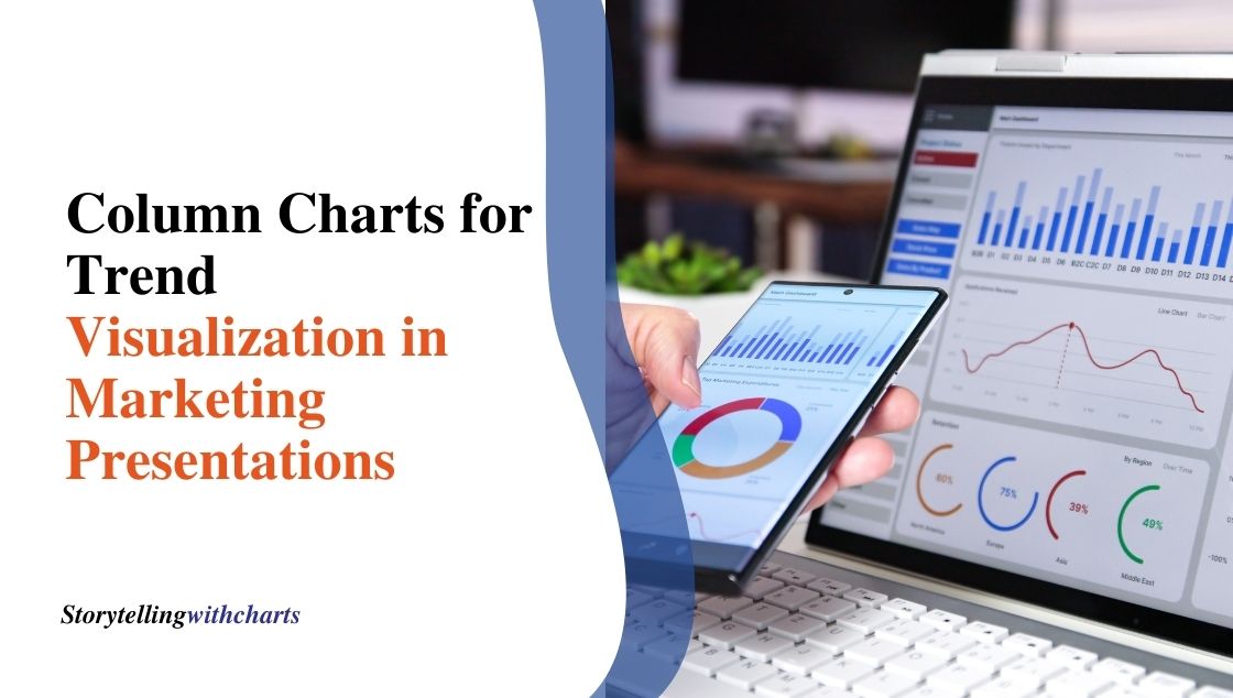
Column Charts for Trend Visualization in Marketing Presentations
When giving marketing presentations, using visuals to share data and insights makes your information easier for audiences to grasp. Of…
Read More
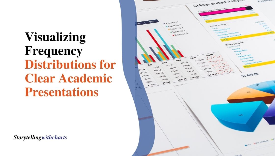
Visualizing Frequency Distributions for Clear Academic Presentations
When presenting research findings, it’s important to showcase patterns and trends in data in an easily digestible manner. Visualizing frequency…
Read More

The Ultimate Guide to Item Comparison: Elevate Your Data Presentation Skills
Making comparisons is fundamental to many decision-making processes, whether in business, research, or our personal lives as consumers. However, comparing…
Read More
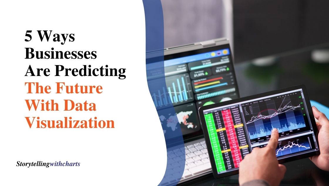
5 Ways Businesses Are Predicting the Future With Data Visualization
From spotting trends to weather forecasts, predictions and predictive data visualization help us plan for the future. Businesses are now…
Read More
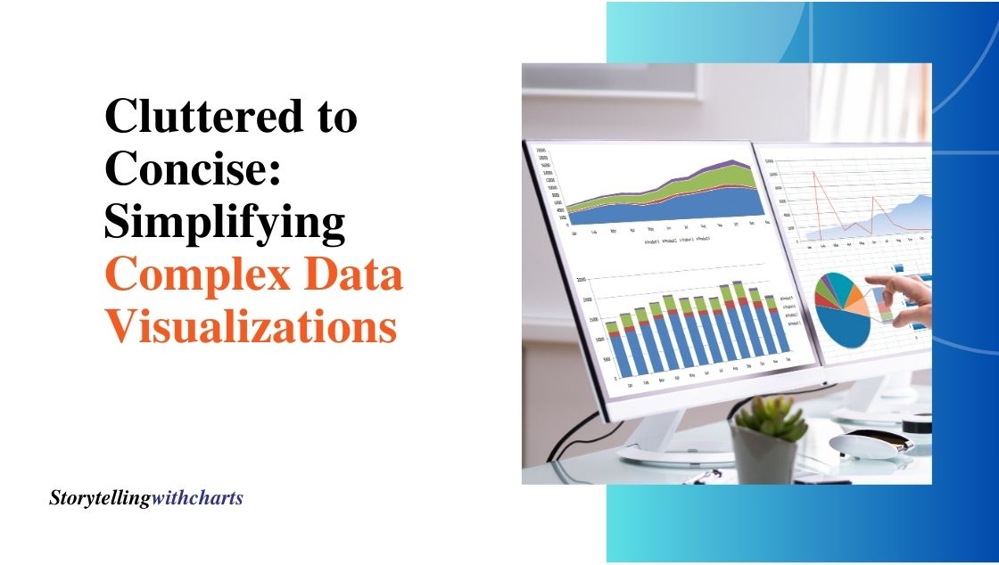
Cluttered to Concise: Simplifying Complex Data Visualizations
Data charts don’t have to be confusing eyesores that spin your head. Even the most complex datasets can be turned…
Read More
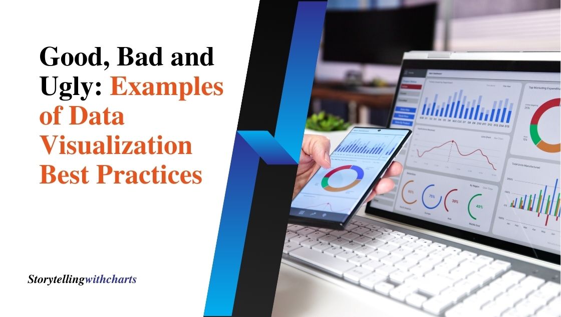
Good, Bad and Ugly: Examples of Data Visualization Best Practices
We live in a data-rich world. Making sense of endless rows and columns is challenging. This is where data visualization…
Read More
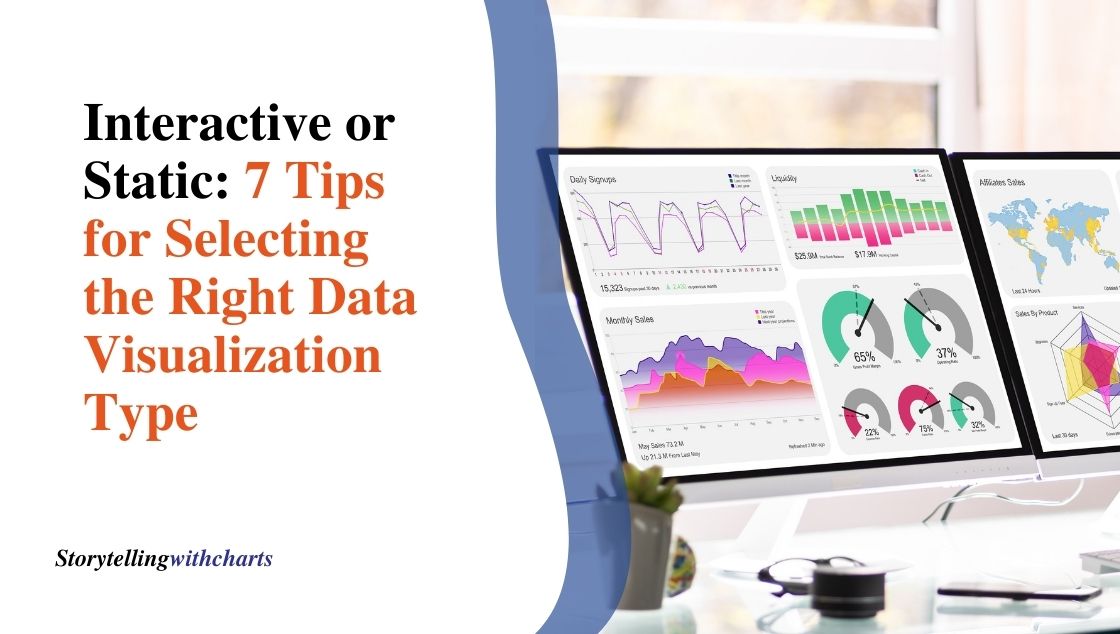
Interactive or Static: 7 Tips for Selecting the Right Data Visualization Type
Deciding on the most effective way to visually represent data can be tricky. But with countless chart formats to choose…
Read More

Artificial Intelligence’s Role in Data Visualization: An Overview
The convergence of artificial intelligence in data visualization is transforming how we explore and present data. As AI capabilities grow…
Read More
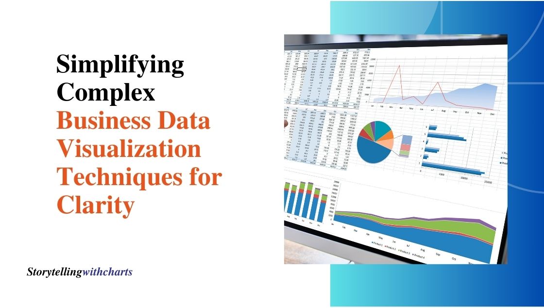
Simplifying Complex Business Data: Visualization Techniques for Clarity
Data is essential for businesses to track performance, identify opportunities, and guide strategy. However, raw data alone can be overwhelming…
Read More