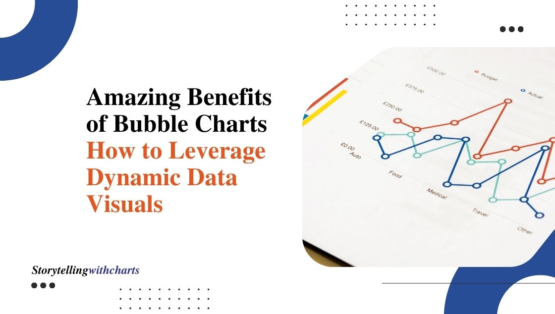
6 Amazing Benefits of Bubble Charts: How to Leverage Dynamic Data Visuals!
Bubble charts are one of the most versatile data visualization tools used today. With their ability to display multiple data…
Read More
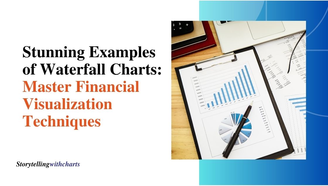
8 Stunning Examples of Waterfall Charts: Master Financial Visualization Techniques!
A waterfall chart is an effective visual tool to display financial data and changes over a period of time. With…
Read More
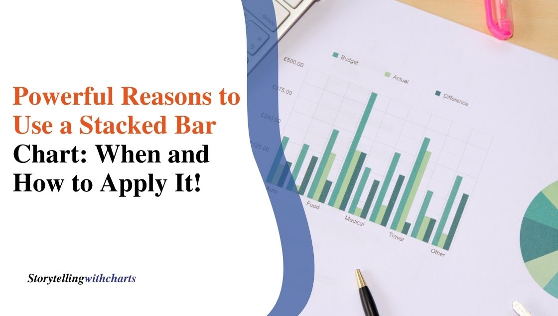
7 Powerful Reasons to Use a Stacked Bar Chart: When and How to Apply It!
A stacked bar chart is one of the most useful yet underutilized chart types. It allows the visualization of part-to-whole…
Read More
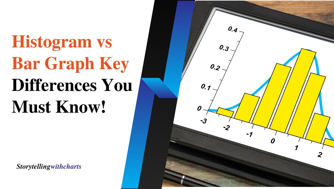
Histogram vs Bar Graph: 5 Key Differences You Must Know!
Data visualization is an important part of data analysis. Charts and graphs allow us to interpret and compare data easily.…
Read More
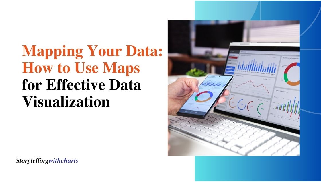
Mapping Your Data: How to Use Maps for Effective Data Visualization
Maps are powerful visual tools for telling data stories. When used effectively, maps can quickly communicate patterns, trends, and insights…
Read More

Design Stunning Dashboards in 5 Simple Steps with PowerPoint Tools
Dashboards are an excellent way to visually present complex data and insights to stakeholders in an easy-to-understand format. Well-designed dashboards…
Read More
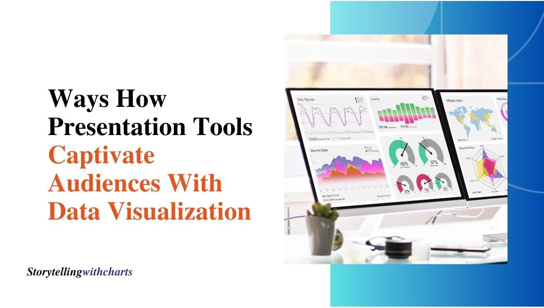
7 Ways How Presentation Tools Captivate Audiences With Data Visualization
Effective communication is vital for captivating audiences and conveying impactful messages. This is especially true when presenting complex data and…
Read More

Engage Audiences with 4 Visual Metaphors Built With Data Tools
Visuals can be powerful tools for communicating insights and engaging audiences. When data is visualized effectively, complex concepts become more…
Read More

Best Practices for Line Charts in Financial Presentations
Line charts are a popular type of chart used often in finance. They show data points connected by lines to…
Read More