
Area Graph Examples: Enhancing Sales and Marketing Strategies Through Data Visualization
Data visualization can be a powerful tool for identifying insights and opportunities in sales and marketing data. Area graphs specifically…
Read More
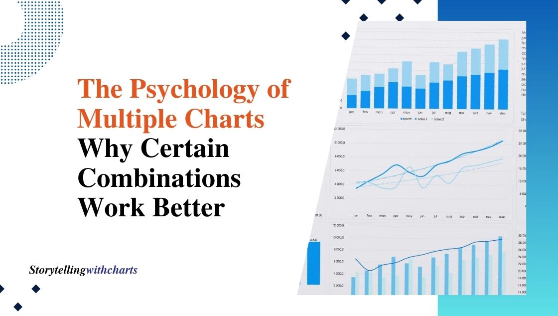
The Psychology of Multiple Charts: Why Certain Combinations Work Better
Data visualization is a powerful tool for communicating insights, trends, and patterns in data. While a single well-designed chart can…
Read More

6 Steps to Making a Histogram in Excel: Create Stunning Visuals Easily!
A histogram is one of the most useful data visualization tools that allows you to represent the distribution of numerical…
Read More
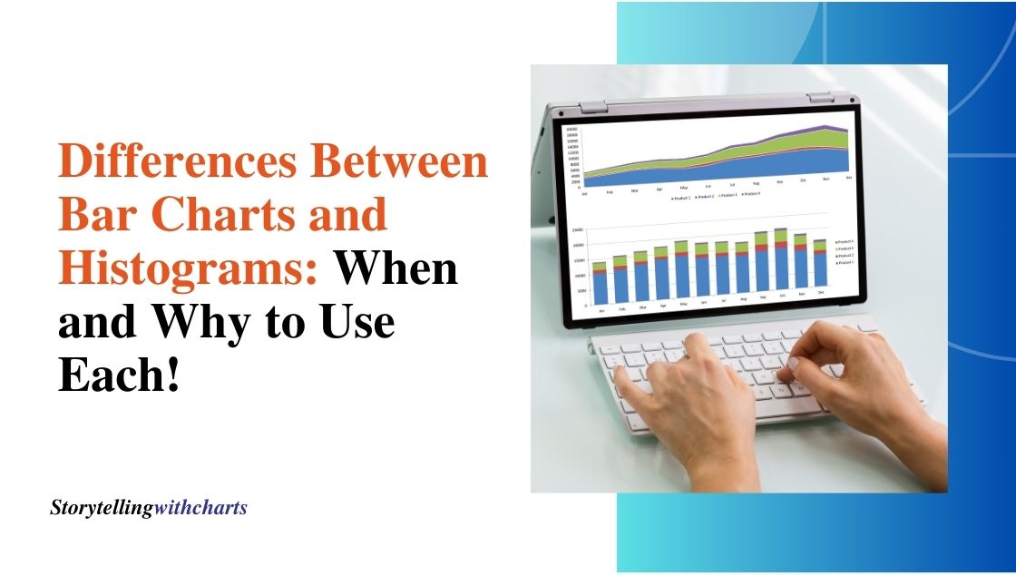
5 Key Differences Between Bar Charts and Histograms: When and Why to Use Each!
When analyzing data, two of the most common visual displays are bar charts and histograms. At first glance, they may…
Read More

8 Steps to Creating a Waterfall Chart in Excel: Ultimate Visual Financial Guide!
Waterfall charts provide a clear visual breakdown of how an initial value transitions to a final amount through various positive…
Read More

7 Easy Ways to Understand Excel Scatter Plots: Visualize Your Data Effectively!
Scatter plots are one of the best graph types for visualizing relationships between two variables in your Excel data. Plotting…
Read More
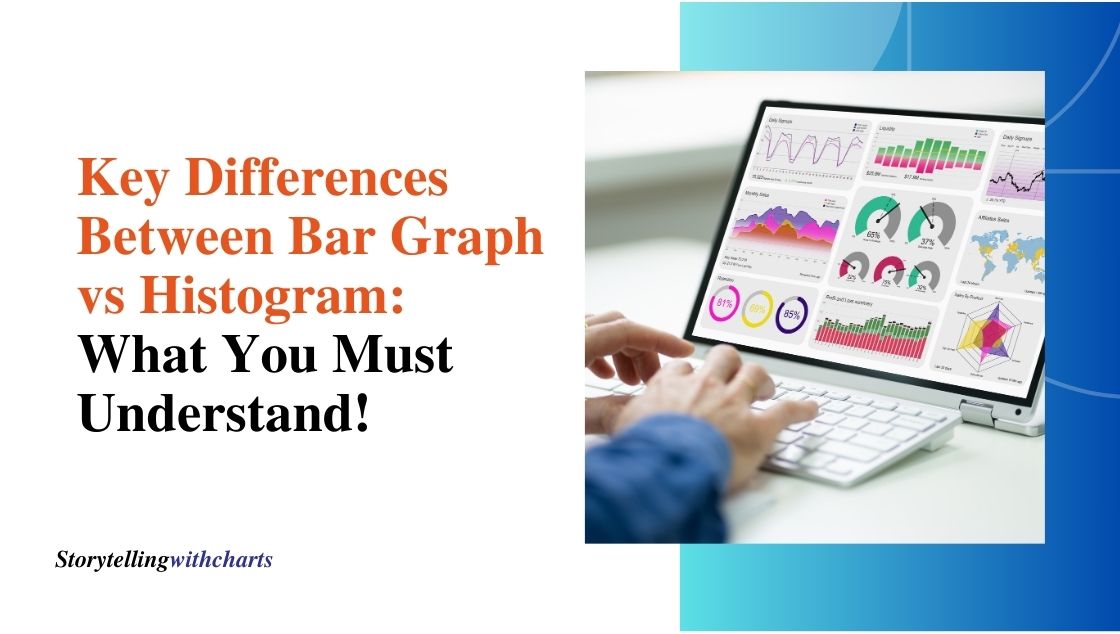
6 Key Differences Between Bar Graph vs Histogram: What You Must Understand!
Data visualization is an important part of data analysis. Charts and graphs allow us to visually represent data to spot…
Read More

Area Chart Insights: Uncover the Hidden Trends in Your Data!
Area charts are a type of graph that can reveal interesting insights and trends hidden within data sets. By shading…
Read More

9 Chart Types You Need to Know: Overcoming Visual Clutter for Clear Insights!
Data visualization represents the fastest path to insights from analytics. Yet many fall into the excess complexity trap, attempting overly…
Read More