Finding the Perfect Data Visual for Your Message and Audience
Data visualization transforms dry, dense datasets into impactful stories that resonate. However, choosing ineffective graphics wastes opportunities to enlighten and influence decisions. Matching visual display to audience perspectives and analytical needs ensures your data resonates. This guide covers choosing the best way to display data tailored to unique communication goals.
The power of data visualization
Data visualization utilizes graphics to uncover insights and make meaning from information. Charts, graphs, and other tools visualize patterns, variations, and trends in data that would remain obscured in tables or text.
Crafting an intuitive visual narrative allows for faster processing of complex data. Viewers can grasp in seconds what might take several minutes to explain verbally. Strategic visuals act as analysis shortcuts, leveraging the power of sight to illuminate key data aspects, thereby relieving the burden of complex data interpretation.
Moreover, in conveying complex concepts or datasets, the best way to display data is by employing methods that simplify the information without sacrificing accuracy or detail. Below, you’ll find the answers to ways to visualize data.
The role of data visualization in decision-making
The right data story empowers better decisions. Visualization enables decision-makers across levels to:
a. Quickly grasp status and progress
Well-designed charts communicate key metrics, indicators, and drivers efficiently. Viewers immediately assess position and gaps versus goals. Also, if you’re searching for which chart type provides the best visual display, it would be better to go into detail about each chart time to get your answer.
b. Spot significant patterns and relationships
Effective graphics spotlight trends, variations, correlations, and contributing factors that tables conceal. Visual cues draw focus to relevant insights.
c. Identify risks, problems, and opportunities
Outlier data points, steep drops, and changes in trajectory signal potential issues or openings worth exploring through interaction with the underlying data.
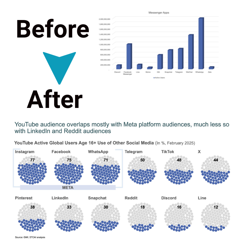
Data visualizations enable dialogue, discussion, and debate centered on information rather than opinion. However, thoughtless graphics undermine trust in data and contribute to confusion and lack of clarity.
Different chart types to consider
Here are key points about different types of charts for data visualization in plain language:
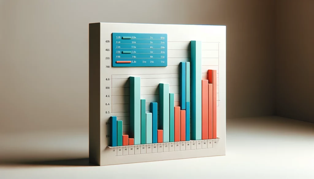
- Bar charts use vertical bars at different heights to compare categories or values. Make relative size and differences obvious visually.
- Pie charts display percentages and parts of a whole. It’s easy to see how something breaks down into smaller pie slices.
- Line graphs track trends and changes over intervals of time. Illustrate ups and downs as lines rise, dip, or zigzag. Reveal patterns by connecting data points.
- Column charts work like bar graphs flipped vertically. Allow you to scan categories chronologically up the vertical axis.
- Dot plots literally plot dots to represent each data point. Let you assess the distribution and clustering of values across a common scale.
- Heat maps utilize color shades in a table format to encode the amplitude and magnitude of values. Pink shades equate to larger numbers than blue.
The choice depends on the intended comparison, relationship, or trend you want to highlight in your data visually.
How to choose the right chart type

Choosing the right chart type is fundamental to effective data visualization. The best visual display for your data depends on what you’re trying to communicate. Here are a few guidelines:
- To compare values: Bar or column charts clearly compare different groups or categories.
- To show distribution: Box plots and histograms are great ways to display the data distribution, helping to understand the range, median, and outliers.
- To understand relationships: Scatter plots can highlight the relationship or correlation between two variables.
- To depict parts of a whole: Pie charts or donut charts effectively show how individual parts contribute to a total.
Considering the message you wish to convey and the nature of your data is the best way to select the appropriate chart type.
Best practices in data visualization
To ensure your visualizations are compelling, here are some best practices:
- Keep it simple: The best way to display data is often the simplest. Avoid clutter and unnecessary decorations that can distract from the key message.
- Be accurate: Ensure your visualizations accurately represent the underlying data. Misleading scales or cherry-picked data can undermine your credibility.
- Use color wisely: Color can be a powerful tool for highlighting and differentiating data points, but it should be used sparingly and consistently.
- Label clearly: Labels and legends should be clear and legible, making it easy for your audience to understand the presented data.
- Know your audience: Tailor your visualization to the level of understanding and interests of your audience. This consideration is crucial in determining the best way to display data.
Conclusion
Finding the best way to display data is an art as much as a science. It requires a deep understanding of the data and the audience’s needs and preferences. By choosing the right chart type, employing best practices in data visualization, and always considering the impact of your visualizations on decision-making processes, you can ensure that your data tells a compelling and understandable story.


