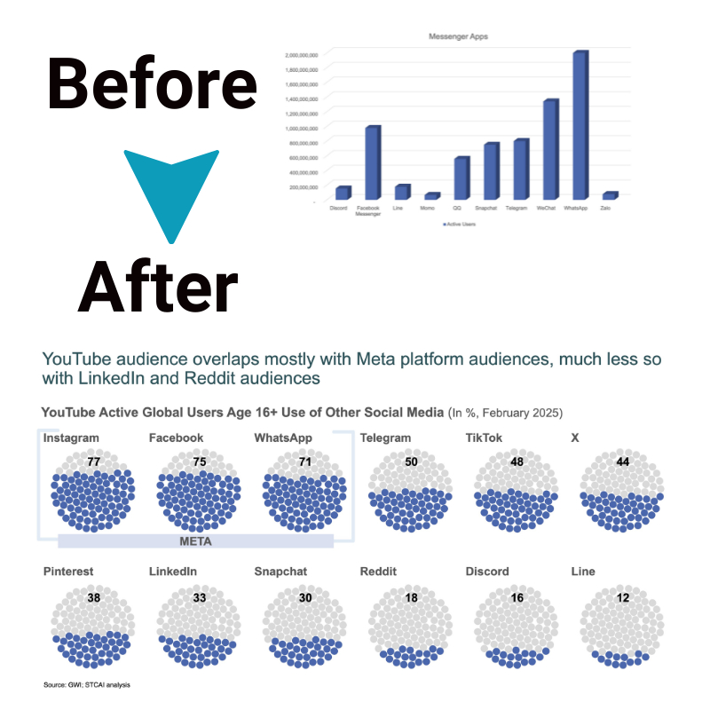
Beginner’s Guide to Designing Pictographs in PowerPoint
Have you ever needed to visually represent data in a way that’s easy to understand? A pictograph might be the perfect solution! In this guide, we’ll walk you through everything you need to know about designing pictographs in PowerPoint—from the basics of a pictograph to creating one step-by-step. Don’t worry if you’re new to this; we’ll keep things simple and beginner-friendly.
What Is a Pictograph?
Before diving in, let’s start with a pictograph definition. A pictograph is a type of chart or graph that uses icons, images, or symbols to represent data points. Instead of numbers or bars, it relies on pictures to make data visually engaging and easily digestible.
Why Use a Pictograph?
- Clarity: They make complex data more understandable.
- Engagement: Pictographs catch the audience’s attention more effectively than plain numbers.
- Versatility: They work for all kinds of data, from sales figures to survey results.
For instance, imagine showing how many apples people eat each day. Instead of writing “15 apples,” you can use an icon of an apple to represent this data. This is the essence of a pictograph.
What You’ll Need
To create a pictograph in PowerPoint, you need just a few basics:
- Data: Have a clear set of numbers or facts you want to visualize.
- Icons/Images: Simple, recognizable icons work best for pictographs.
- PowerPoint: Any recent version will work.
If you don’t have suitable icons, don’t worry—PowerPoint has built-in tools to help you find or create them. Alternatively, you can use an online pictograph maker like Canva or Visme to get more options.
Step-by-Step Guide to Creating a Pictograph in PowerPoint

Now let’s get into the fun part: designing your own pictograph! Follow these steps to create a visually appealing and informative pictograph in PowerPoint.
Step 1: Open PowerPoint and Start a New Slide
- Launch PowerPoint and open a blank presentation.
- Add a new blank slide. This gives you plenty of space to design your pictograph.
Step 2: Decide on the Data and Icons
Decide what data you want to represent. Let’s use an example:
You want to show how many hours students spend on homework each week. The data looks like this:
- 5 hours: Student A
- 10 hours: Student B
- 15 hours: Student C
Next, choose an icon that represents your topic. For our example, a pencil icon works well.
Step 3: Add Icons to the Slide
- Go to the Insert tab in PowerPoint.
- Click on Icons (or Pictures if you have your own images).
- Search for a relevant icon, such as “pencil,” and insert it into your slide.
Repeat this step to add as many icons as you need for your data points.
Step 4: Resize and Align Icons
To make your pictograph clear and professional:
- Select an icon and resize it by dragging the corners.
- Arrange the icons in rows or columns.
- Use the Align tool under the Format tab to make sure everything is evenly spaced.
For instance, if Student A spent 5 hours on homework, place five pencil icons in a row. Add 10 pencils in a row for Student B, and so on.
Step 5: Add Labels
Every pictograph needs labels to explain what the icons represent.
- Insert a text box near your icons by clicking Insert > Text Box.
- Write clear labels, such as “5 hours – Student A.”
- Place the labels close to their respective rows of icons.
Step 6: Add Color and Style
Make your pictograph visually appealing by:
- Adding Color: Use different colors for each row of icons to distinguish between data points.
- Using Shapes: Add background shapes (like rectangles) to group related data.
To color the icons, select one, go to the Format tab, and choose Fill Color. This simple touch makes your pictograph pop!
Step 7: Review and Adjust
Take a step back and review your pictograph. Is it clear and visually appealing? Are the icons and labels easy to read? Make adjustments as needed.
Pictograph Example
Here’s a practical pictograph example based on our earlier data:
Topic: Weekly Study Hours for Students
- Student A (5 hours): Five pencil icons in a row.
- Student B (10 hours): Ten pencil icons in two rows of five.
- Student C (15 hours): Fifteen pencil icons in three rows of five.
This layout gives a quick, at-a-glance understanding of the data.
Tips for Designing Great Pictographs
Creating a good pictograph isn’t just about adding icons. Keep these tips in mind:
- Keep It Simple: Avoid clutter. Use one icon type and keep the layout clean.
- Stay Consistent: Use the same size and style for all icons.
- Use Legends: Add a legend if your pictograph includes multiple datasets.
- Test Readability: Show your pictograph to someone else to ensure it’s easy to understand.
Tools to Enhance Your Pictographs
While PowerPoint is a great starting point, you can explore other pictograph maker tools for additional features. Some popular options include:
- Canva: Offers drag-and-drop functionality with thousands of icons.
- Visme: Provides advanced customization and templates.
- Infogram: Focused on creating interactive charts and graphs.
These tools can save you time and provide design inspiration.
When to Use Pictographs
Pictographs are ideal for:
- Business Reports: Representing sales or performance data.
- Education: Teaching concepts in a visually engaging way.
- Marketing: Displaying survey results or consumer behavior.
For example, a teacher could use a pictograph to show how many students prefer different ice cream flavors—using icons of cones and scoops!
Common Mistakes to Avoid
As you design your pictographs, steer clear of these pitfalls:
- Overloading Icons: Too many icons can overwhelm the viewer. Summarize your data if necessary.
- Lack of Explanation: Always include labels and legends to clarify what the icons mean.
- Poor Scaling: Ensure each icon represents a consistent quantity (e.g., one icon = 5 units).
The Bottom Line
Now you know how to create a beautiful, effective pictograph using PowerPoint! Remember, a well-designed pictograph is more than just a pretty picture—it’s a powerful tool for communicating data clearly and engagingly.
Whether you’re making a presentation, teaching a class, or sharing business insights, pictographs can help you deliver your message with impact. So, gather your data, choose your icons, and start designing today!


