Beginner’s Guide to Box and Whisker Plots in PowerPoint
Data visualization plays an integral role in presenting complex information in a clear and accessible way. One powerful method of visualizing data distribution is the Box and Whisker Plot, which is highly effective in comparing datasets across multiple categories. If you want to create Box and Whisker Plots in PowerPoint, this guide will take you through the basics of understanding and creating these charts step by step.
What is a Box and Whisker Plot?
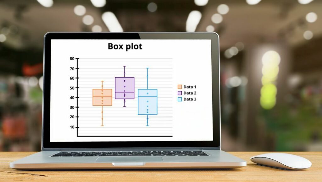
A Box and Whisker Plot, also known as a box plot, is a graphical representation of the distribution of a dataset. It breaks the data into quartiles and visually represents the minimum, first quartile, median, third quartile, and maximum values, using a “box” and “whiskers.” Critical components of a Box and Whisker Plot include:
- Minimum Value: The most minor data point.
- First Quartile (Q1): The value that divides the lower 25% of data.
- Median (Q2): The middle value separates the lower 50% from the upper 50% of the data.
- Third Quartile (Q3): The value above 25% of data lies.
- Maximum Value: The most significant data point.
The whiskers extend from the box and show the range of the data, while points outside the whiskers are considered outliers. These plots are particularly useful for displaying large amounts of data in a concise, comparative format, mainly when grouped into categories.
Why Use a Box and Whisker Plot?

A Box and Whisker Plot is beneficial because it allows quick and clear visualization of data spread, central tendency, and variability. Here are a few reasons why you should use a Box and Whisker Plot:
- Effective Comparison: Box plots allow you to compare multiple data sets side-by-side in a single graph. This makes identifying trends, outliers, and differences between datasets easier.
- Simplifies Data Interpretation: It provides a visual summary of key statistics (minimum, maximum, median, and quartiles), making it easier for the audience to understand the data distribution at a glance.
- Detects Outliers: It helps you quickly identify data points that deviate significantly from the rest of the dataset, offering valuable insights for decision-making.
Creating a Box and Whisker Plot in PowerPoint: Step-by-Step Guide
PowerPoint may not have a direct Box and Whisker Plot Maker, but it does provide a simple way to insert and customize these charts. Here’s how to create one:
Step 1: Prepare Your Data
Before creating a Box and Whisker Plot in PowerPoint, ensure your data is organized and ready for use. Typically, the data should consist of numerical values grouped into categories, such as test scores from different schools or process data from other machines.
Step 2: Insert a Chart
To insert a Box and Whisker Plot in PowerPoint:
- Go to the Insert Tab: In PowerPoint, select the Insert tab at the top.
- Click on Chart: From the Illustrations group, click Chart. This will open a dialog box with various chart types.
- Select Box & Whisker: Under the All Charts tab, choose Box & Whisker.
PowerPoint will automatically generate a chart, and an Excel sheet will open for you to enter or import your data.
Step 3: Customize the Chart
Once the chart is inserted, you can customize it to suit your needs better:
- Edit Data: Replace the placeholder data with your dataset in the Excel window.
- Change Chart Design: Click the Chart Design tab to adjust the chart style, add chart titles, and modify colors.
- Format Data: Right-click on the chart’s elements (like boxes or whiskers) to format them. You can change the fill color, add borders, and customize whiskers.
Step 4: Format for Clarity
Ensure the chart is legible for your audience:
- Label the Axes: Make sure the X-axis and Y-axis are clearly labeled.
- Highlight Key Values: Use bold or different colors to highlight important data points, like the median or outliers.
Step 5: Final Touches
Once in the field with the chart, add elements, such as text boxes for explanations or arrows pointing out key features.
Customizing a Box and Whisker Plot in PowerPoint
PowerPoint offers several customization options to enhance your Box and Whisker Plot and make it more effective for presentations:
- Gap Width: Adjust the space between categories to simplify the chart.
- Inner Points: Show or hide the data points between the lower and upper quartiles.
- Outlier Points: Display points that fall outside the whiskers, helping to highlight anomalies in the data.
- Mean Line: Add a line to show the mean of the data, which can be a helpful reference point.
Tips for Creating Clear and Impactful Box and Whisker Plots in PowerPoint
To ensure your Box and Whisker Plot is both practical and aesthetically pleasing, follow these tips:
- Keep it Simple: Avoid cluttering the chart with excessive information. Only show vital data points and features, such as the median, quartiles, and outliers.
- Use Contrasting Colors: Choose colors that stand out and help different components (boxes, whiskers, outliers) to be easily distinguishable.
- Label Key Points: Add data labels to make your plot more informative, especially for the median and outliers.
- Use Annotations: If needed, add annotations or a legend to explain the chart to your audience, especially when comparing multiple datasets.
Conclusion
Creating a Box and Whisker Plot in PowerPoint is a great way to visualize and compare multiple datasets. This chart type provides clear insights into data distributions, helping you make more informed decisions. Whether working with test scores, processing data, or comparing different groups, a well-designed Box and Whisker Plot can enhance your presentations.
Following the steps outlined above and using PowerPoint’s customization tools, you can craft impactful visualizations highlighting key trends and outliers. Remember, the key to an effective chart lies in clarity, so avoid overcomplicating the design and focus on making the data easily understandable for your audience.


