Art and Analytics: Blending Creativity With Data Visualization
Data visualization seamlessly fuses analytics and artistry. The numbers provide the factual foundation, while illustrations and graphic design bring data to life. An intuitive visual narrative makes complex statistics accessible and memorable. When insightful datasets meet creative flair, dry digital information morphs into colorful infographics that captivate audiences and spark “aha moments” of clarity. The synergy of data, design, and visual storytelling makes numbers more relatable, and ideas truly resonate.
Telling compelling stories with data visualization
At its core, impactful data visualization is about storytelling – weaving dry statistics into compelling narratives that inform, inspire action, or spur change. The most talented data storytellers understand that facts don’t speak for themselves, no matter how accurate the numbers are. Engaging anecdotes, smart framing, thoughtful flow, and strategic visuals are key. The best data stories feel natural, not forced.
They activate our emotions as well as our intellect. And they reveal hidden truths in ways that tables of numbers alone never could. Data becomes far more powerful and persuasive when infused with humanity’s innate gift for storytelling.
An overview of data visualization
Data visualization is all about transforming dull statistics into vivid graphical stories that captivate audiences. It entails mapping numbers to appropriate visual elements like shapes, sizes, colors, and positions that amplify insights within large datasets. Quality Data visualization makes it easy for viewers to spot patterns, trends, and outliers at a glance. The goal is to construct meaningful narratives that bring the data to life in relatable ways, conveying the “ah-ha” moments hidden behind rows and columns of figures.
Creative techniques and formats
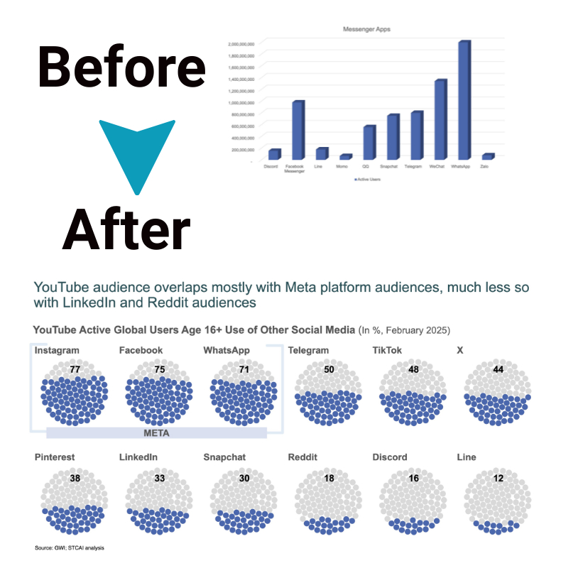
While basic charts like bar graphs, pie charts, and line graphs certainly have their place in clearly displaying comparisons, proportions, and trends, data visualizers should be bold in pushing boundaries and getting creative. Illustrations, product images, data-driven infographics, animations, and unexpected page layouts can help surface hidden insights that conventional graphs may not reveal.
Blending tried-and-true visualization formats with artistic flair and inventive multimedia can make data come alive. The key is ensuring any creative techniques spotlight the core statistics and trends, providing illumination rather than distraction. Controlled visual wit and whimsy make the data more relatable, memorable, and shareable. When done skillfully, data storytelling with a slight artistic license can transform dry numbers into an insightful narrative that sticks.
Art’s role in impactful data stories

While accurate data analysis is crucial, displaying that information effectively requires creativity and design skills. The human brain processes visuals much differently than rows of numbers or paragraphs of text. Artistry grabs attention and makes data more memorable.
A designer’s visual flair brings lifeless statistics to life through compelling graphics, layouts, typography, color palettes, and more. Using charts and diagrams is a start, but custom illustrations, data-driven imagery, animation, and innovative formats take it further. These artistic techniques surface hidden insights, guiding the viewer’s eye to key takeaways. They turn complex datasets into intuitive narratives that stick with audiences well after glancing at the usual spreadsheet. Blending analytics with artistry makes for powerful, actionable data stories.
The synergy between scientific and creative thinking takes data visualization beyond functionality into the realm of inspiration. Art gives structure, emotion, and accessibility to lift factual analysis from informing to truly enlightening audiences.
Ensuring analytical integrity
Data stories need to be more accurate and transparent regarding their scientific integrity. No matter how gorgeous the graphics, methodology matters. Rigorously gathered, statistically sound datasets, without errors or sampling bias, must anchor creative flair. When science and artistic creativity balance, it makes data digestible to wider audiences and earns public trust.
Strategies to balance form and function
Great data visualizations blend qualitative design appeal with quantitative credibility:
- Lead with good questions, not just aesthetic urges
- Build on statistical best practices
- Test out multiple visual approaches over the same strong dataset
- Ask for feedback to identify designs that communicate insights clearly
- Always cite sources and outline limitations upfront
The future of facts and design
Expect more humanistic yet data-driven visualizations as better tools democratize dynamic reporting capacities once exclusive to elite programmers. Big data analytics provides immense volume. Augmented reality offers immersive environments. Open-source creative coding toolkits make customization accessible. And smarter AI recommendation algorithms help surface meaningful visual patterns within massive datasets. The synergy of art and science continues propelling data visualisation to new heights.
The bottom line
Art makes complexity clear; analytics makes creativity credible. By unlocking insights from data through graphics infused with imagination, audiences discover deeper perspectives that inspire rather than overwhelm. Vibrant colors and engaging imagery illuminate comprehensive trends in memorable fashion. Data storytelling that moves, delights, and enlightens isn’t achieved through cold statistics alone.
Harmoniously blending analytics and aesthetics forges the visual experiences that transform mundane metrics into human insight that lingers long after the numbers have faded.

