Area Graph Examples: Enhancing Sales and Marketing Strategies Through Data Visualization
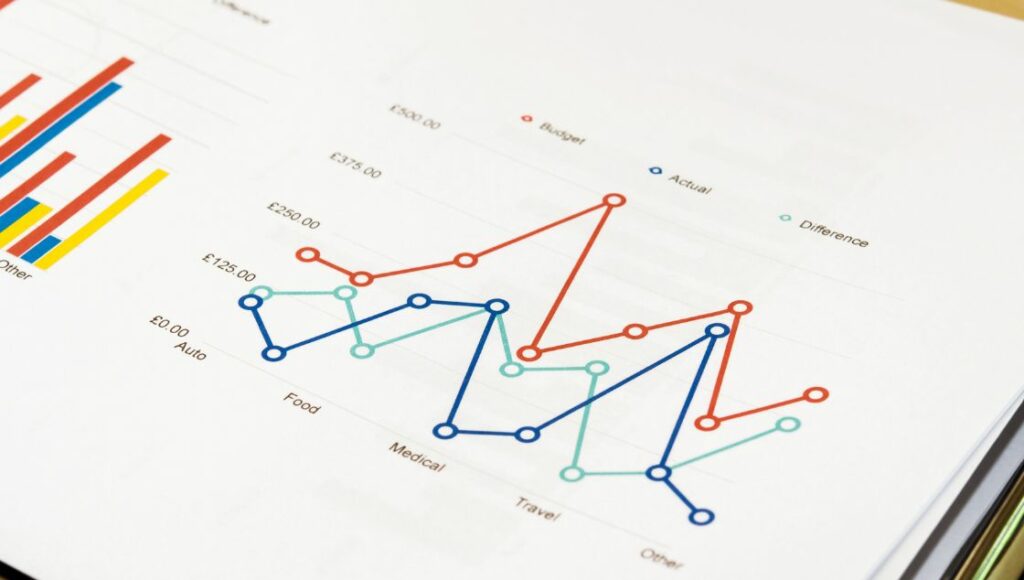
Data visualization can be a powerful tool for identifying insights and opportunities in sales and marketing data. Area graphs specifically allow us to track metrics over time and compare categories, making them ideal for analyzing trends and performance.
In this article, we’ll explore what area graphs are, their key benefits, when you should use them, and examples of how they can be applied to sales and marketing objectives. We’ll also discuss best practices for choosing the right data, effective design principles, and tools to help you implement area graphs into your own strategy.
What is an Area Graph?
An area graph, also known as an area chart, is a type of data visualization used to represent quantitative values over a continuous interval or period. It displays metrics as shaded areas underneath a line, allowing us to emphasize volume and degree of change.
The x-axis shows the progression of time, while the y-axis represents the measurable value. Instead of simply connecting data points with straight lines, as in a line graph, the area between the axis and the line is filled with colour or shading. This effectively demonstrates the overall magnitude and trends.
Key Advantages of Using Area Graphs

There are several key reasons area charts can be extremely useful for sales and marketing analysis:
- Visualizing Trends Over Time: Area graphs excel at showing the progression of metrics like revenue, conversions, traffic, etc. The filled area makes it easy to see overall increases, decreases and fluctuations.
- Comparing Multiple Metrics: Multiple data sets and metrics can be plotted on the same graph, allowing direct visual comparison over the same period.
- Intuitive Format for Broader Audience: With colorful shading underneath lines, area graphs draw attention and are easy for even non-technical audiences to quickly interpret.
When to Use An Area Chart
Area charts have some specific use cases where they excel compared to other types of data visualization:
- Better for Continuous Data – Area graphs are ideal for continuous metrics over time, rather than sparse individual data points. This makes them applicable for most sales and marketing objectives.
- Showing Trends and Changes Over Time – Area graphs’ primary strength is indicating shifts and trajectories in metrics, which is essential for identifying challenges and opportunities.
- Time-Based Comparisons – Plotting and comparing multiple metrics along the same timeline with area graphs is easier than pie charts or scatter plots.
Examples of Area Graphs for Sales and Marketing
Let’s look at some specific examples of how they can be powerful tools for enhancing sales and marketing strategies:
1. Sales Revenue Over Time
One of the most universal applications is using area graphs to view revenue growth and dips over weeks, months, and years. Shade overlays make it easy to analyze performance goals and events that impacted sales:
[Area graph showing revenue increasing and decreasing over 2-year timeline, with annotations calling out promotions driving spikes]
2. Marketing Campaign Performance
We can also leverage area charts to compare email marketing and social media performance over any date range. Identify channels driving the most traffic to inform future resource allocation:
[Area graph with overlapped lines showing social media driving more traffic than email campaigns]
3. Product Category Sales Comparison
Analyzing sales across product categories can reveal opportunities to expand high-performers and phase out underperformers. Area graphs make it easy to plot multiple lines and find these insights:
[Area chart showing steady electronics sales vastly outpacing drop in apparel sales]
4. Customer Acquisition Over Time
Area graphs can track new customer sign-ups for customer-centric businesses over months and years. See if marketing campaigns lead to drive sustainable growth or short spikes:
[Area chart of customer acquisition jumping during promotions then leveling off]
How Area Graphs Enhance Strategies
Here are these Graph strategies:
Identifying Genuine Sales Trends
The core strength of area charts is their ability to showcase trends and trajectories. Analyzing the steepness of different slopes and fluctuations quickly highlights genuine sustained growth, revealing what’s working.
Accurately Analyzing Marketing ROIs
By plotting campaign spending on the same area chart as traffic or conversions generated, we can demonstrate marketing ROI over any time period. No more guesses on what performed best.
Monitoring Product Lifecycles
Using area graphs to monitor sales growth and decline makes it easier to spot rising starts and fading performers. This helps inform decisions to invest more or phase out based on real data.
Customer Segmentation
Splitting area graph lines by customer demographics or purchase history allows you to identify your highest-potential segments to target more aggressively.
Best Practices for Implementation
To leverage area charts effectively, there are some best practices around setup, design, and tools we recommend following:
Choosing the Right Data
One of the most critical best practices when implementing area charts is selecting the appropriate data to chart over time. The key is identifying metrics that demonstrate continuity rather than sparse, intermittent data points. Options like revenue, website traffic, and customer sign-ups work very well for most sales and marketing objectives.
Revenue charts reveal growth trajectories and highlight successful promotions that caused spikes. Website traffic area graphs easily correlate increased conversions with impactful marketing campaigns or viral content.
Intuitive Design Principles
Some core design principles like simplicity, spotlighting only the most strategic data sets, and an uncluttered layout set truly effective and intuitive area charts apart. The most insightful yet easy-to-digest area graphs use basic fill colors and legible labels instead of flashy graphics. They also focus on just 3-5 key metrics instead of congesting the chart with too many overlapping lines.
And finally, intuitive area charts utilize ample white space instead of cramming in unnecessary company branding or excessive text. This clarity and strategic emphasis allows the area chart data story to shine. Keeping these principles of simplicity, spotlighting and space in mind when designing area charts will maximize their communication potential.
Powerful Creation Tools
Fortunately, modern data analysis software provides user-friendly area chart integration right out of the box. Excel enables straightforward area chart creation through its standard bar chart setting, with the stacked curve fill option delivering flexible shading. Tableau offers robust area chart customization for more advanced analysts, like dual axis formatting, trend lines and forecasting capabilities.
Google Data Studio allows anyone to generate area charts connected to Google Analytics data, with helpful features like filtering and drill-downs. Tapping into these powerful creation tools removes barriers and empowers virtually any team member to assemble compelling, interactive area chart visualizations independently.
Conclusion
In today’s highly competitive marketplace, leveraging data visualization, specifically area charts, can give sales and marketing teams an edge. Plotting key metrics over time makes identifying genuine trends and opportunities easier. Area graphs empower us to recognize what strategies are moving the needle so we can double down on what works and shift investments away from what doesn’t.


