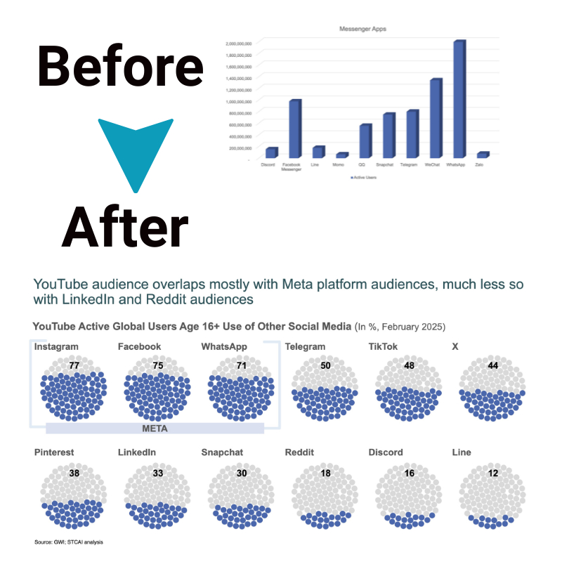
6 Amazing Benefits of Bubble Charts: How to Leverage Dynamic Data Visuals!
Bubble charts are one of the most versatile data visualization tools used today. With their ability to display multiple data variables simultaneously, bubble charts are unmatched in their capability to uncover and communicate complex patterns and relationships in data.
In this article, we will explore what bubble charts are, the situations where they are most effective, and the six amazing benefits you get from using bubble charts to display your data.
What is a Bubble Chart?
A bubble chart is a data visualization plotting data points in a 3D space, with the size of the bubble representing an additional data variable. Specifically, bubble charts display:
1. The X-axis representing one data variable
2. The Y-axis representing another data variable
3. The Z-axis, represented by the size of the bubble, plotting a third data variable.
This allows a bubble chart to reveal correlations and relationships between three variables. For example, a bubble chart may depict the relationship between company revenue (X-axis), profit margin (Y-axis) and market valuation (Z-axis as bubble size) to reveal patterns within the dataset.
When to Use Bubble Charts

Bubble charts are most effective when you want to:
- Analyze relationships between three quantitative variables from a multivariate dataset.
- Uncover patterns within complex data by comparing and correlating multiple variables simultaneously.
- Display relative values in the data via the bubble size. For example, market share, sales volume, social media followers and other metrics intuitively map to bubble size.
- Show outlier data points prominently via enlarged bubble size for emphasis.
- Display data trends over time by animating bubble chart data or using a fourth data variable mapped to bubble color.
Data analysts and data scientists often use bubble charts, especially in economics, business analytics, big data analytics, population demographics, and other quantitative domains.
Here are some situations where bubble charts outshine:
- Comparing company performance by plotting profit versus revenue with market capitalization as bubble size.
- Identifying growth trends and outliers by charting population versus GDP per capita with annualized growth rate as bubble size.
- Analyzing social media metrics by mapping followers versus engagement rate with post frequency as bubble size.
- Displaying research publication data with citations vs. journal impact factor employing author count as bubble size.
As you can see, bubble chart use cases span various industries. Wherever you need to understand and present relationships between three key variables, bubble charts will come to your rescue!
Limitations and Considerations
While bubble charts are powerful, like all visualizations, they also have some limitations:
- Bubble overlaps can obscure data points and make comparisons challenging for dense datasets. Solutions include filtering the data to reduce density or using different axes scales.
- Pixel constraints in digital rendering can limit resolution for detecting smaller trends. To reduce uncertainty, statistical analysis alongside the bubble chart is recommended.
- Adding too many bubbles, colors, sizes, or other elements creates clutter and cognitive overload, reducing a chart’s efficacy. Aim for simplicity—introduce only as much chart complexity as needed to communicate the core insights.
- Understanding these constraints will help create bubble charts that effectively show key data stories without compromising understanding.
6 Benefits of Bubble Charts
Here are six stellar benefits you gain by adding bubble charts to your data visualization toolkit.
1. Enhanced Data Visualization
Bubble charts deliver enhanced data visualization by displaying multiple variables simultaneously, helping spot hidden trends and multivariate relationships. Animating bubble charts over time adds a fourth data dimension, taking insight potential to the next level. Plot any data with x, y, and z components; bubble charting unlocks next-level visualization.
2. Multivariate Analysis
Bubble plots empower dynamic multivariate analysis by encoding multiple variables within one chart. You can use just one chart type to correlate revenue, costs, market share, or countless combinations across verticals and domains.
Notice outliers, clusters, degree of correlation, and other patterns; studying variables in isolation is impossible. This powerful analytical advantage makes the bubble chart a versatile tool for multidimensional quantitative analysis.
3. Clear Representation of Data Relationships
Via x and y coordinates and z-axis bubble sizing, bubble charts vividly display the relationship between data points. Diameter encapsulates the relative significance of a data point, making outliers, highs, and lows apparent instantly.
Bubble proximity maps correlation, allowing viewers to interpret complex statistical relationships at a glance. Patterns emerge more clearly through the representation of graphical data, amplifying insight.
4. Effective Trend Identification
Adding a temporal element like date or age to the x- or y-axis transforms bubble charts into powerful trend visualization tools. One can track clusters and changes in data points across timeframes, identifying trends, inflection points, and anomalies.
Animating the bubble chart timeline amplifies the effect, allowing viewers to ingest trend shifts phenomenally. This rapid pattern recognition facilitates insightful trend analysis from multivariate data.
5. Engaging and Interactive Data Exploration
Bubble chart interactivity grabs user attention while granting data exploration flexibility. Hover tooltips provide specific coordinate data. Click events can trigger other visualizations like histograms or scatter plots for the data point. Segmenting and filtering bubbles enable customized data investigation.
These user-driven features promote deeper information engagement, empowering stakeholders at all levels to analyze findings and uncover their insights through guided discovery.
6. Simplifying Complex Data
Taking convoluted multivariate data and distilling clear relationships understandable by wider audiences is a lingering challenge in analytics. Bubble charts help overcome the complexity barrier through intuitive visual encodings and simplified representation.
Captivating visuals transcend jargon, making statistical data analysis accessible to all. Bubble charts leverage innate human visual pattern recognition to rapidly convert multifaceted data insights into business value.
Best Practices for Effective Bubble Charts
Here are four best practices to employ:
1. Plot the Most Impactful Variables
Determining the best three variables is critical – overlooking this will cause the core data narrative to lack context. Brainstorm all relevant factors, then limit selection to those carrying maximum analytical weight for the target investigation.
2. Mind Limits and Process Constraints
Account for digital display and human cognition limits by avoiding too much complexity. Find the balance between simplicity and density to spotlight insights effectively.
3. Map Variable Attributes Intentionally
Thoughtful mapping of x, y, and z variables ensures accurate data representation and prevents distortion. For reliable analysis, map continuous quantitative metrics to coordinates and discrete measures to bubble size.
4. Enhance Responsibly
Consider animations, color coding and interactivity to boost engagement but only where appropriate. Don’t over-embellish without purpose, as excessive enhancements obscure understanding.
Conclusion
With the unrivalled potential to bring multivariate data stories to life, bubble chart adoption confers an undisputed competitive advantage. Visually uncover hidden insights faster through enhanced statistical data representation only bubble plotting provides.
Yet without a solid handle on bubble chart mechanics, use cases, benefits and limitations, these “3D data explorers” remain underutilized for many. Understanding bubble chart fundamentals opens the door to maximizing information returns from complex business datasets.
Start bubble charting today and overcome multivariate data complexity to uncover game-changing insights. The decision is yours!


