Achieving Data Clarity: How to Communicate Your Data Effectively Using Advanced Tools
In today’s data-driven world, effectively communicating insights from data analysis is more critical than ever. However, more than raw data is needed to tell a compelling story or influence stakeholders. Advanced tools for data visualization, statistical analysis, and real-time reporting are essential for transforming complex data into impactful narratives that drive business decisions.
In this blog, we’ll explore some of the latest technologies for enhancing data clarity and equipping analysts, scientists, and business leaders with the power to share data persuasively.
Importance of Effective Data Communication
Before diving into specific tools, it is crucial to understand why effective data communication matters. Here are a few key reasons:
- Drives better and faster business decisions based on data-backed insights rather than intuitions or assumptions
- Ensures alignment and consensus among stakeholders regarding priorities and strategies
- Builds trust and credibility through transparency and clarity
- Motivates teams by connecting their day-to-day work to larger organizational goals
- Identifies problems early while they can still be corrected cost-effectively
Tools for Enhancing Data Clarity
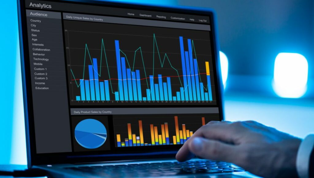
1. Advanced Data Visualization Tools
Data visualization refers to representing information graphically using charts, graphs, and other imagery rather than just numbers or text. Modern visualization tools go far beyond basic bar charts to provide rich, interactive dashboards that make large datasets easily digestible.
a. Tableau
As an industry-leading business intelligence platform, Tableau enables interactive data exploration with drag-and-drop ease of use. Key features like automated chart types, trend lines, and forecasting models allow non-technical users to uncover patterns and trends quickly. Tableau can integrate data from multiple sources, perform aggregations and calculations on the fly, and produce publication-quality visualizations optimized for different devices.
b. Power BI
Power BI is Microsoft’s data analytics solution, which consists of a desktop interface, cloud-based services, and mobile apps. It provides user-friendly data modeling capabilities and sub-second query responses powered by in-memory data storage. Integrations with other Microsoft products like Excel and the ability to embed reports in SharePoint and Teams make Power BI a versatile tool for enterprises. Data gateways support accessing on-premises and software-as-a-service applications.
c. Google Data Studio
As a fully web-based visualization tool, Google Data Studio removes dependencies on specific operating systems. Simple drag-and-drop and widget-based authoring allow users to build dashboards rapidly. Free to use and integrated with Google marketing products like Search Console and Analytics, Data Studio is especially popular with agencies and marketing teams. Open access and browser-based consumption improve report accessibility.
2. Statistical Tools for Data Analysis
While visualization makes data more accessible to comprehend, statistical analysis helps users derive actionable quantitative insights. Open-source tools like R and Python have become popular alternatives to traditional statistical software for machine learning and predictive modeling.
a. Python
Thanks to user-friendly syntax and scalability, Python has emerged as a top choice for data science applications. Libraries like SciPy, StatsModels, Pandas, Matplotlib, and Seaborn reduce the learning curve by providing pre-built functions for mathematical modeling, data manipulation, and advanced plotting. Python can integrate with big data platforms like Hadoop and Spark for large-scale analytics. Many organizations use Python for building machine learning algorithms due to robust tooling and active contributor community.
For those without coding expertise, software like SPSS and SAS offer graphical user interfaces, report builders, and menus to perform statistical analysis. Their ability to handle large datasets, provide data mining algorithms, and quantify uncertainties makes them invaluable for data scientists.
3. Real-time Data Reporting Tools
For today’s digital businesses, static reports and batched analysis are giving way to automated dashboards powered by real-time data. This enables much faster response times for emerging trends, risks, and opportunities. Tools like Tableau CRM and Zoho Analytics make this achievable without expensive data infrastructure.
a. Tableau CRM
Built on the Salesforce platform, Tableau CRM enables live dashboards that combine transactional data with analytics and AI to surface real-time insights. Pre-built templates, analytics within workflows, and easy mobile access empower employees to make data-driven decisions on the go. Automated and scheduled reports can be shared across the organizations based on user access rights. Natural language queries allow business users to explore data through conversational interfaces.
b. Zoho Analytics
With Zoho Analytics, organizations can connect data from multiple sources, prepare data models, analyze data, and create interactive dashboards with drag-and-drop simplicity. They can also schedule dynamic reports, set alert thresholds, and create goals and metrics to monitor performance in real-time. They can blend transactional data with historical data to identify problems and opportunities as they emerge. They can also share live dashboards securely with other users or embed them into internal web portals and applications.
The Bottom Line
Data is a critical business asset whose value lies in interpretation and communication rather than raw numbers alone. Visually engaging reports, statistically sound analysis, and real-time dashboards enabled by tools like Tableau, Power BI, Python, and Zoho provide a competitive edge for data-mature organizations. The democratization of data analytics opens the door for evidence-based innovation and decision-making at all levels of the business.