A Quick Guide to Online Chart and Graph Makers for Every Skill Level
Today, the ability to create charts and graphs effectively is not just a skill but a necessity for anyone dealing with data. Whether you are a student, a business analyst, or a researcher, presenting your data visually can significantly impact how your audience understands and interacts with your findings. Fortunately, numerous online graph maker tools cater to various skill levels, making it easier than ever to create a graph or chart.
This guide uncovers how to create charts and graphs using different tools and insights to make your data visualization journey as smooth as possible.
Understanding chart types
It’s crucial to select the correct chart form for your data. To create charts and graphs, you can make use of the following options:
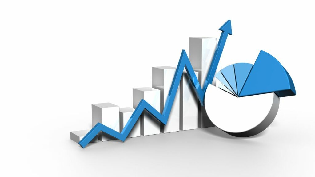
a. Pie Chart: A pie chart is ideal for showing parts of a whole. It’s perfect when you want to display the percentage distribution of a small number of categories. Pie charts are a great option to choose to create charts and graphs.
b. Bar Chart: Bar charts are versatile and great for comparing different groups or tracking changes over time, especially when the changes are significant.
c. Column Chart: Similar to bar charts, column charts are used to compare data across categories. They are particularly effective for showing data changes over a period. To create charts and graphs in columns, pick these types of charts.
d. Line Chart: Line charts are excellent for displaying trends over time. Use a line chart when you have a continuous data set and want to highlight increases or decreases.
e. Dot Chart: A dot chart is a less common choice but powerful for showing precise data points and comparing them across categories or over time.
Strategic use of charts
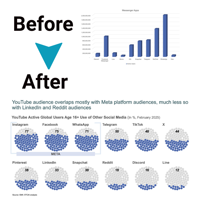
When creating data visualizations, choosing a chart type that aligns with your analytical purpose is the most important strategic decision. Rather than defaulting to a generic chart, adapt your choice to highlight key aspects of your dataset’s unique narrative.
If you wish to facilitate component or item comparisons, select graphic formats optimized for contrasting differences/similarities between categories. Bar and column charts make categorical comparisons extremely intuitive by leveraging length to showcase value variances between groups or list items. Alternatively, dot plots position dots staggered along an axis, elucidating ranking and priorities.
Choose timeline-centric charts that emphasize progressive developments. Simple yet flexible line graphs shine a light on rises, falls, and plateauing through the connection of plotted dots. Stacked area graphs build on this for aggregated trend data, with shaded zones proving useful for depicting volume or share changes over time.
For distribution visualizations, look beyond the default pie chart. Histogram columns provide greater detail on data frequency across meaningful intervals. Overlaid bell curves showcase means and probability c.
Finally, remember to leverage charts optimized specifically for correlation data. Here, the focus is on relationship analysis rather than discrete values. Scatter plots serve as the quintessential example, with coordinate dot plotting elucidating the degree of connection between two given variables. Heat maps provide another option, using color gradients to indicate concentrations.
Beyond charts: incorporating visual concepts

Going beyond basic charts and graphs can make your data come alive. Incorporating visual concepts and metaphors that connect with your audience makes the information more impactful and memorable. Here are some creative ways to achieve this:
1. Flow diagrams
Illustrating processes and relationships is easy with flow diagrams. Simple linear flows with arrows are great for showing step-by-step progressions. Vertical flows work well to depict hierarchies and chains of command. With the right tools, anyone can create charts and graphs that clearly communicate complex data to a broad audience.
Circular flows are perfect for demonstrating cycles – from production to water cycles. They illustrate how components interconnect within a closed system.
2. Dynamic concepts
Static data can be hard to wrap your head around. Bring your data to life by using visuals that depict dynamic concepts.
Show opposing forces, conflicting trajectories, or tension between data points. Illustrate when a system changes course – this shows progression or regression.
Leverages and balances also demonstrate relationships. Visualize scales coming into equilibrium, seesaws leveling after weights are redistributed, or balances adjusting as new data inputs are added or removed.
3. Metaphorical imagery
Abstract information is engaging when paired with symbolic imagery that connects with audiences. Relatable concepts do some of the heavy lifting, allowing faster comprehension.
Borrow from games by showing targets, scoring, rule sets, and penalties. Sports analogies also tap into viewers’ competitive spirit while showing metrics for which they can root. Puzzles similarly engage audiences in piecing information together, revealing insights.
Getting creative with visual concepts and everyday metaphors makes your data less sterile and more grasping. Humanize information to create an emotional bridge between viewers and the story the data tells.
Harnessing online tools to create charts and graphs
Several online platforms cater to diverse needs, from straightforward pie charts to intricate interactive visualizations:
- Canva: With its intuitive design and vast template library, Canva is perfect for beginners looking to create a graph with flair.
- Google Charts: This free graph generator is robust and integrates seamlessly with other Google applications, accommodating users of varying expertise.
- Tableau Public: For those ready to explore deeper data analysis, Tableau offers advanced visualization capabilities.
Selecting an appropriate tool depends on your specific requirements—from data complexity to desired visual impact.
Effective visualization tips
To maximize the effectiveness of your data visualizations, keep the following in mind:
- Audience Understanding: Design your visuals with the audience’s knowledge and interests at the forefront.
- Simplicity is Key: Aim for clarity and avoid cluttering your visuals with too much information.
- Color Strategy: Use color to enhance comprehension, not overwhelm it.
- Accuracy Matters: Ensure your visuals truthfully represent the data, avoiding any potential misinterpretation.
The bottom line
Creating charts and graphs is critical in the digital age, facilitating clear and compelling data communication. With the wide array of online graph maker tools available, anyone can create a graph that speaks volumes. You can transform raw data into persuasive narratives by selecting the right chart type, leveraging visual concepts, and choosing the best tool for your needs. Whether you’re presenting complex data analyses or simple statistics, the right approach to data visualization can make all the difference.


