15 Types of Charts and Graphs to Enhance Your Data Storytelling
The big data market is heading toward $401.2 billion by 2028. If numbers scare you or bore you in an inherently data-based world, you will have to find a way to come out of it. Thankfully, you can rely on a plethora of charts and graphs to make data more interesting. With different types of charts and graphs at your disposal, you will even be able to weave meaningful narratives through them. So, check out the different varieties of charts and graphs for data visualization.
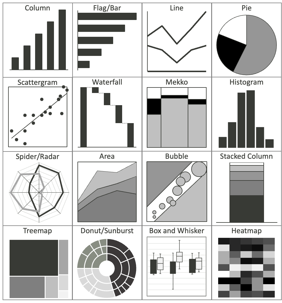
- Column chart
A column chart is ideal for comparing different items over some time. You will be able to present your data in chronological order with this chart. Moreover, it is perfect for highlighting specific dates from your data set. Column groupings deliver sharp contrast well-suited for spotting performance outliers and laggards relative to relevant benchmarks over time. Their compiling effect also visually signifies accumulating or decrementing aggregate quantities. Animating column progression fosters engaging data story arcs. Just beware of excessive stacking obscuring underlying composition.
- Pie chart
Pie charts are one of the data visualization techniques used to represent numbers as percentages. But remember that pie charts are only ideal for representing a small data set. When applied judiciously to low-complexity breakdowns, pie charts efficiently spotlight proportional parts-to-whole compositions or quantified subgroup hierarchies through angular sharing. We instantly comprehend “this slice is twice as large as that sliver” when all radiate from a common core.
- Line chart
A line chart is about revealing trends or progress over some time. Among the different types of charts, a line graph is highly efficient for representing a continuous data set. Tracing line charts’ graceful arcs intuitively conveys acceleration, inertia points, and directionality shifts in the data’s sequential narrative flow. Viewer interpretation perceives not only apparent increases and decreases but the sinuous contours in between – the tempo, variability, and momentum. Lines help us visualize intangible continuity, envisioning forward projection guided by emergent shapes.
- Funnel chart
Imagine a diagram that maps the journey of users through a conversion process. This unique chart, known as a funnel chart, showcases each stage of the process in a section that grows smaller as it leads down the funnel’s path. From the broad opening at the top to the narrowing end at the bottom, the chart visually depicts the decrease in numbers as users move through each stage.
- Bar chart
Among the different types of graphs, this variety comes to your rescue while comparing more than 10 items. You should mindlessly choose bar charts when you need to represent huge contrasts between two data points. Bars deliver hard-edged high contrast for categorical or time-series comparisons where distilling “more than / less than” relativities matters most. Their clustered segmentation also subdivides multipart compositions for easy parsing.
- Scatter plot
Among different types of graphs, a scatter plot can help in representing the relationship between items with different data sets and variables. In these charts, dots are plotted along the x-y coordinate system. Some scatter plots also include an extra trend line. Scatter plots uniquely unveil multivariate correlations – “mapping multidomain interplay across custom axes pairings” unlike umbrella charts cramming dimensions radially.
- Bubble chart
You will find several similarities between bubble charts and scatter plots. However, the number of visual elements in a bubble chart is more than that of scatter plots. Therefore, you will be able to represent more than two numeric values using bubble charts. Bubbles build upon scatter plots’ fundamental pairing of x and y variables by encoding an extra data dimension in relative bubble size. We instantly perceive triplets of relationships – positional correlations on axes plus cardinal magnitudes indicated area-wise. Bubbles better visualize entity concentrations than heatmap grids when geographical mapping is irrelevant.
- Gantt chart
By using a combination of bars and axes, a Gantt chart showcases tasks and their timelines simply and effectively. Each task is uniquely represented by a horizontal bar that stretches across the chart, providing a clear idea of its duration. With bars plotting progressions and linked dependencies through time, Gantts offers more nuanced schedule tracking than basic milestone timeline plots. We map critical paths – identifying risky sequences vulnerable to coordinated delays that undermine initiatives through rippling disruption.
- Dual axis chart
A dual-axis chart visually presents two distinct sets of data on separate y-axes. It enables effortless comparison of two variables with distinct scales or units of measurement. The independence of dual y-axes accommodates unrelated magnitudes and units otherwise inexpressible together – plotting website visitors and customer satisfaction on shared scales proves meaningless.
- Area chart
An area chart is like a line chart, but it’s filled in with a color or pattern underneath the line. This can help with data storytelling techniques like illustrating how different parts make up a whole, such as the sales numbers of each rep over a year. It’s a great tool for analyzing both the bigger picture and specific trends for each individual.

- Waterfall chart
Waterfall charts are a data visualization method to represent the increase of an initial value and the decrease of a series of intermediate values. This eventually results in a final value. These types of charts are ideal for visualizing revenue growth through financial statements.
- Heat map
A heat map illustrates the correlation between two elements and presents a comprehensive range of ratings, from top to bottom or inferior to superior. This visual uses shades or intensities to convey the rating scale. Heatmaps wield color-intrinsic magnetism for attention direction, harnessing hues and saturation signaling to spotlight data priorities.
- Stacked bar chart
Stacked bar charts help in comparing items that are different from one another. These types of charts can also help express the composition of every item that is being compared. Stacked bar charts can be highly beneficial for marketing purposes because they help represent a lot of data within a limited space.
- Bullet chart
A bullet chart is a valuable tool for visually depicting performance in relation to a target or benchmark. Commonly featured in dashboards and scorecards, these charts offer a concise way to showcase key performance indicators.
- Matrix chart
A matrix chart presents information in a structured grid, with rows and columns representing varying factors or groups. The points where rows and columns intersect house specific data, which can be depicted through colors or numbers.
Conclusion
With a variety of chart types available, you will always have interesting ways to visualize data. But it’s always necessary to use the right type of charts and graphs to represent a set of data. Always consider your type of data before picking a chart or graph to display it. In case you need tips related to choosing the right data visualization charts and graphs, secure your copy of StoryTelling with Charts now.